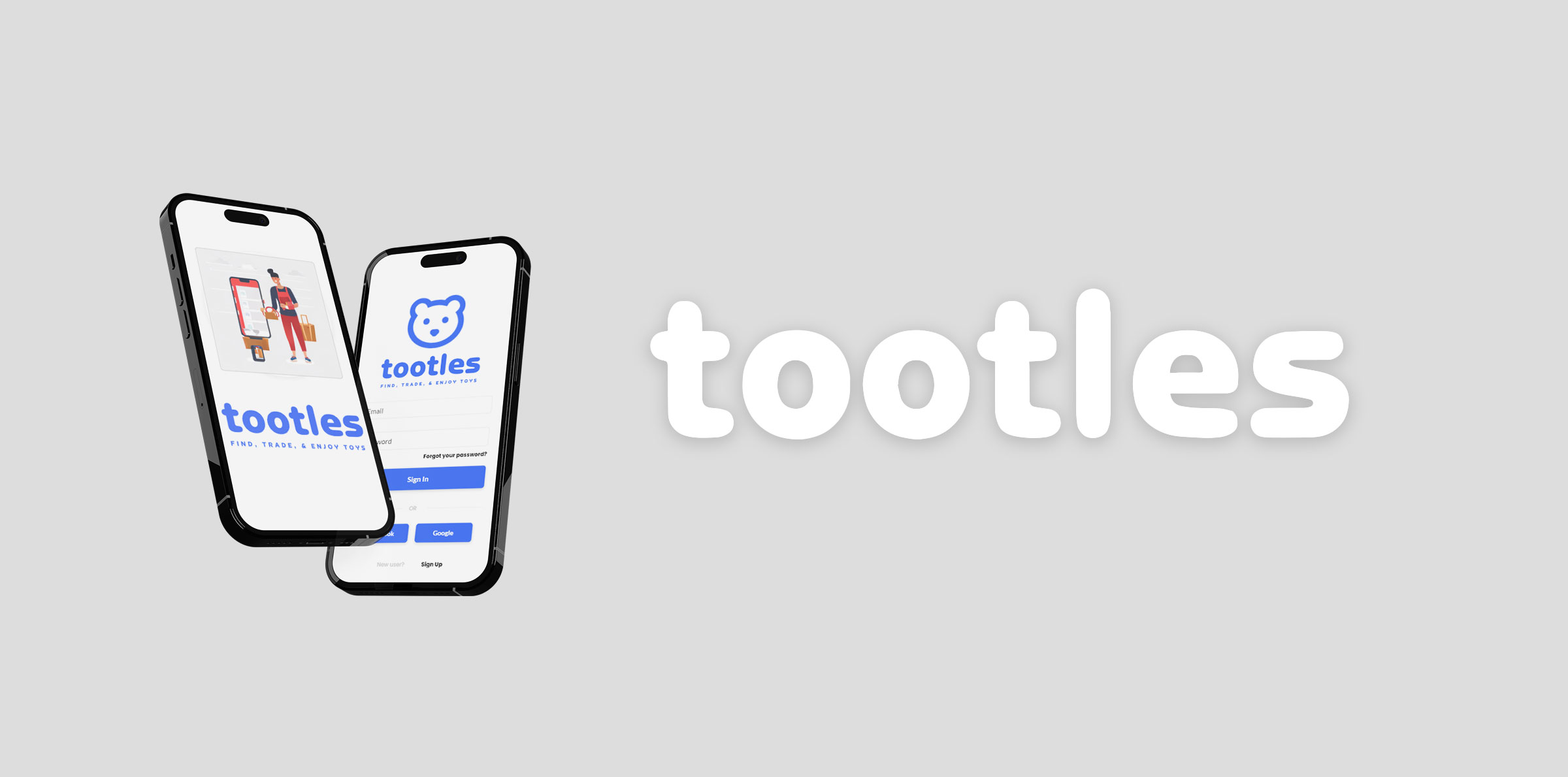
Tootles
Introduction
In this comprehensive case study, I will outline the step-by-step process of creating a mobile application called Tootles. The app aims to provide a safe and enjoyable platform for parents and guardians to exchange toys for their children, encouraging sustainable practices and fostering a sense of community. As the sole designer on this project, my objective was to deliver an intuitive, visually appealing, and user-centric app to enhance the toy-trading experience.
User Research
In the initial stage of the Tootles app's development, the primary objective was to embark on a comprehensive research and discovery process. This phase aimed to delve deeply into the minds and preferences of the target audience—parents and guardians with children aged 3 to 10 years—to gain valuable insights that would shape the app's design and functionality. By conducting user-centric research, I wanted to understand the motivations, challenges, and aspirations of these environmentally conscious individuals interested in sustainable toy trading to reduce toy waste.

Target Audience
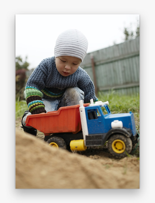
The Tootles app is strategically designed to cater to a specific group of parents and guardians, namely those with children aged 3 to 10 years. This age range encompasses a crucial period in a child's development, where toys play a vital role in fostering creativity, imagination, and learning. Tootles aims to be the go-to platform for environmentally conscious individuals who not only seek to provide their children with a diverse array of toys but are also keen on making sustainable choices that contribute to reducing toy waste. These environmentally conscious parents actively look for opportunities to engage in eco-friendly practices, and toy trading represents a promising avenue to achieve this goal. By facilitating the exchange of toys between families, the app encourages the reuse and repurposing of toys, aligning with the values of these conscientious users who prioritize environmental sustainability.
User Interviews
To initiate the design process, I conducted in-depth user interviews with five parents to understand their motivations, challenges, and preferences related to toy trading. Additionally, an online survey was distributed to a larger audience to gather quantitative data and identify trends.

Sophie (Age 32)
A working mother of two children aged 4 and 6. Sophie is passionate about sustainability and actively seeks ways to reduce waste in her household. She is excited about the concept of toy trading as a means to declutter her home while giving her kids access to new and diverse toys.

David (Age 40)
A single parent raising a 7-year-old daughter. David leads a busy life as a freelance graphic designer and values convenience and simplicity. He is interested in exploring toy exchanges to save money while offering his daughter opportunities to discover unique toys that align with her interests.

Linda (Age 29)
A stay-at-home mom with a 3-year-old son. Linda is eco-conscious and actively involved in a local parenting community that advocates sustainable practices. She sees toy trading as a chance to connect with other like-minded parents while promoting a greener lifestyle for her family.

Mike (Age 36)
A father of two boys aged 8 and 10. Mike is concerned about the environmental impact of excessive toy consumption and wants to teach his children about responsible toy ownership. He sees toy exchanges as an educational opportunity for his kids to learn about sharing and reducing their ecological footprint.

Emily (Age 42)
A grandmother of a 5-year-old granddaughter. Emily loves spending time with her granddaughter and enjoys spoiling her with toys. However, she also believes in teaching her the value of reusing and repurposing items. She is curious about toy trading as a way to introduce sustainable practices to her family.
Key Insights
During the research phase, several key insights emerged, shedding light on the motivations and priorities of our target audience. The feedback gathered from parents and guardians provided valuable guidance in shaping the Tootles app to meet their needs effectively. Here were the 3 insights from the research:
- Parents value sustainable practices and expressed a willingness to participate in toy trading to minimize environmental impact.
- Trust and safety were significant concerns in peer-to-peer exchanges, with users seeking a secure platform for transactions.
- Parents are often busy, so simplicity and ease of use were essential to encourage continued engagement with the app.
Design Approach
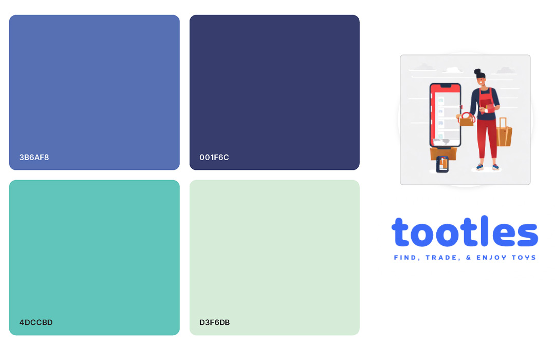
Given the child-oriented nature of the Tootles app, our design approach was centered around creating an enchanting and inviting visual experience that would resonate with both children and parents alike. The visual design emphasized a friendly and playful aesthetic while maintaining a professional and trustworthy appearance. To achieve this delicate balance, a vibrant and cheerful color palette was carefully selected, incorporating lively hues that stimulated creativity and excitement. Warm tones of green and blue evoked a sense of nature and sustainability, aligning with the app's eco-friendly theme.
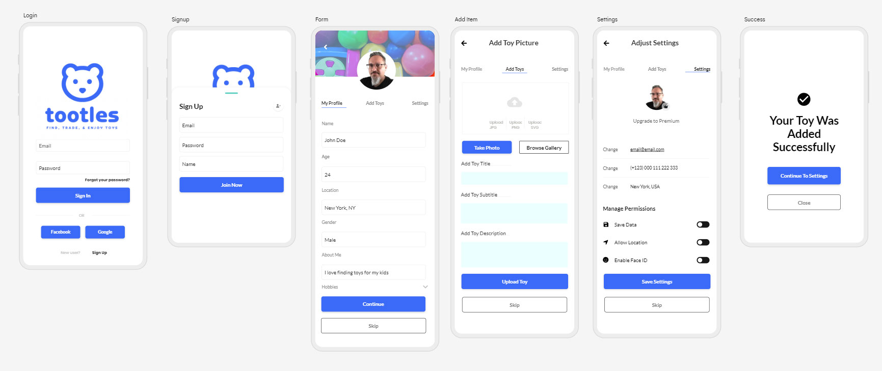
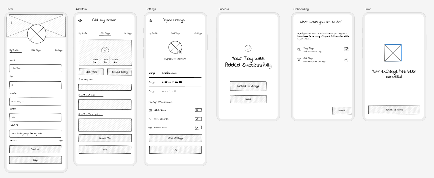
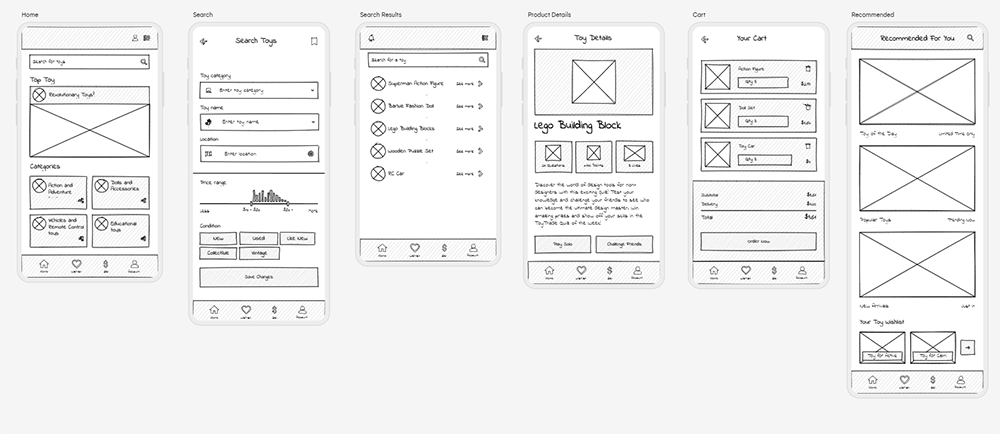
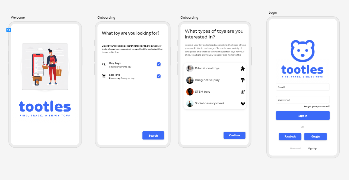
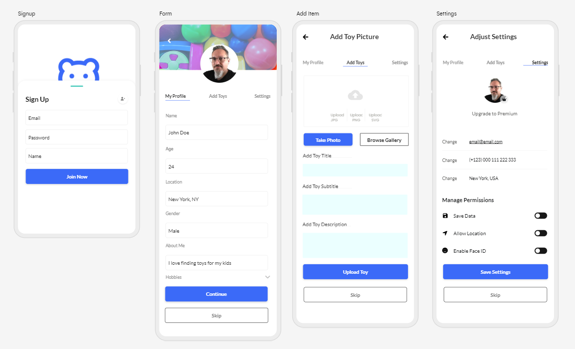
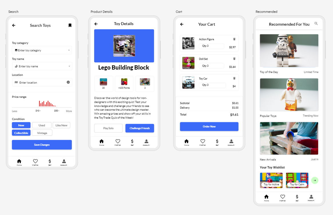
Features and Functionalities
Based on user research, the following key features were identified and prioritized:
- User Registration and Authentication: A seamless sign-up process with options for email and social media login.
- Toy Listing with Photos and Descriptions: Users can create listings with images and detailed descriptions of toys they wish to trade.
- Search and Filter Options: An advanced search system that allows users to find specific toys based on various criteria like age range, toy category, and condition.
- Messaging and Negotiation: A secure messaging system that enables users to communicate and negotiate trade terms privately.
- User Profiles and Ratings: User profiles with verified badges and ratings to build trust within the community.
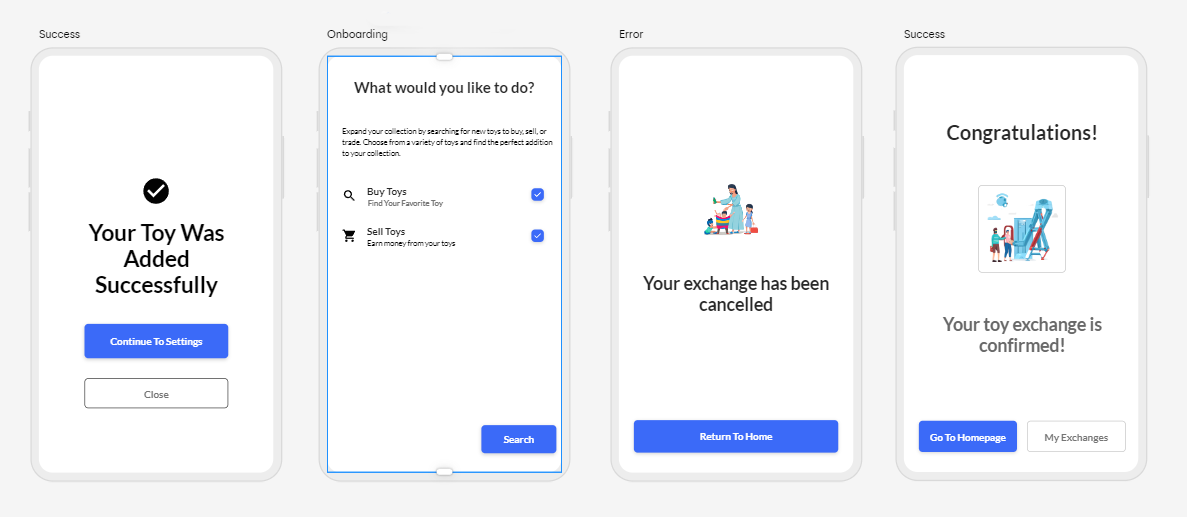
- Notifications and Alerts: Real-time alerts to keep users informed about new messages, trade requests, and other activities.
- Settings and Privacy Controls: Customizable settings to manage privacy and notification preferences.
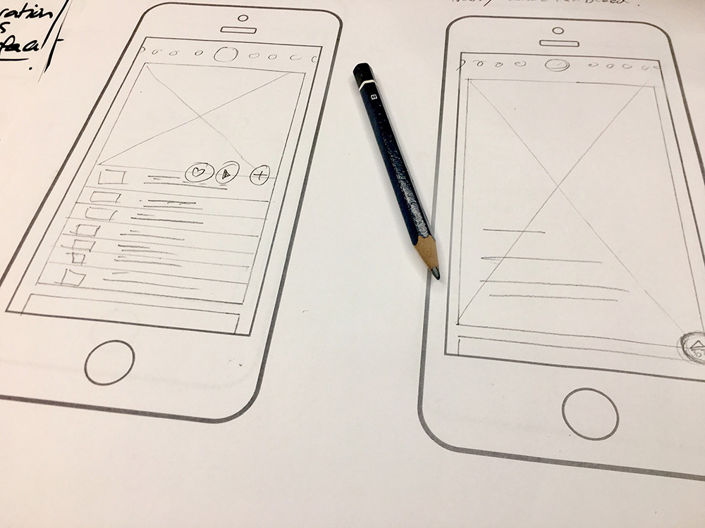
Wireframing
To create a visually appealing and coherent user interface based on the wireframes, maintaining a balance between a child-friendly atmosphere and a professional layout.
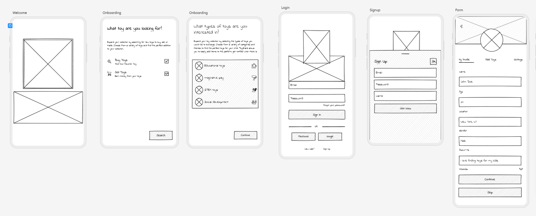
Color Scheme
The color palette was carefully chosen to strike a balance between bright and playful colors to appeal to children and soft, soothing tones to create a calming effect on parents. Vibrant shades of blue and green were primarily used, complemented by warm pastel hues.
Typography
The typography selection using the Lato font family for headings and body text to ensure an optimal reading experience.

Visual Elements
With pastel colors and rounded corners, I created to make the app feel welcoming and establish an emotional connection with the users.


Prototyping and User Testing
Leveraging the power of Figma, I meticulously crafted an interactive prototype that mirrored the intended user experience. This fully functional model allowed me to explore the app's different sections, interactions, and features seamlessly. The prototype featured smooth transitions, intuitive gestures, and realistic user flows to ensure a highly immersive and accurate representation of the final product. The iterative prototyping process allowed me to fine-tune the app's navigation and refine user interactions based on continuous feedback and internal testing.
To gain authentic insights and validate design choices, five potential users were invited to participate in the usability testing sessions. During these sessions, users were encouraged to perform specific tasks and provide feedback on their experiences. Their interactions with the prototype were carefully observed, and qualitative feedback was collected to identify pain points, areas of confusion, and aspects that delighted users. By actively involving users in the testing process, I gained invaluable insights into real-world scenarios and made data-driven decisions to enhance the app's usability and overall user experience.
Key Findings
- Users appreciated the intuitive navigation and colorful visuals, noting that it captured their children's attention and interest.
- Some users found the negotiation process confusing and suggested adding a clearer flow with step-by-step instructions.
- The toy search and filtering options received positive feedback, as they helped users find toys matching their children's preferences more effectively.
Improvements Made
- Redesigned the negotiation flow with step-by-step instructions to guide users through the process clearly.
- Improved the visibility of user ratings and reviews to enhance trust in the trading community.
- Refined the search functionality by adding additional filters and sorting options to provide a better user experience.
Conclusion
The Tootles app presents a user-centric and visually engaging platform for parents to exchange toys sustainably. Through thorough research, iterative design, and user testing, the app offers a safe, seamless, and enjoyable experience for users, aligning with the goal of fostering a vibrant toy-trading community. The final design successfully balances a child-friendly visual appeal with a professional layout, encouraging sustainable toy trading while providing parents with a sense of security and trust in the app.