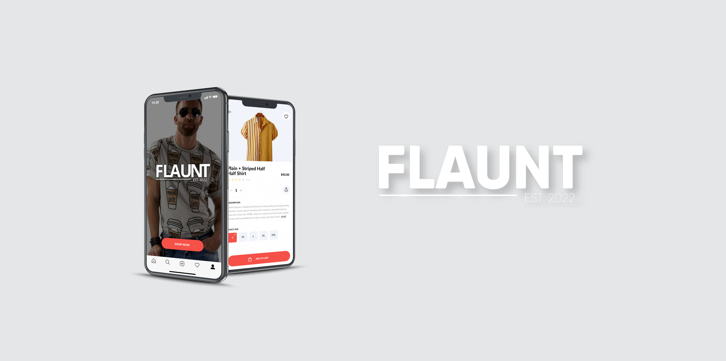
FLAUNT
The Problem
Most shoppers today buy clothing in traditional stores or online. Usually stores cater to a mainstream shopping demographic, but I learned there are LGBTQ+ customers looking for more. While there are LGBTQ-centric brands, they don’t have their own online presence and there isn't a centralized store. I was inspired to create an app that is a centralized hub for shoppers in this niche market to shop for brands they can't find in mainstream stores. The FLAUNT app serves as an Amazon/Walmart-type of service with a collection of specific brands known in the LGBTQ+ community for shoppers to buy merchandise in the comfort of their homes.
Objective & Goals
Here are a couple of major goals this product is targeting:
- Way to shop online for clothing targeted for LGBTQ+ community
- Easily find the clothing and deliver to the home
My Role
While I'm the sole person working on this project, I have covered the following roles in this project.
- UX Research
- UI Design
- Brand Identity
- Design Strategy
My Process
Upon hearing about people who identify as LGBTQ+ and their shopping struggles, I began to research the problem by speaking to people and reading blogs. I looked for myself to see what was out there and what people in this community needed. After analyzing my findings, I built the app through sketches that I turned into wireframes and finally created a hi-fidelity prototype.

Understand

Research

Analyze

Sketch

Prototype

Test
Understanding Business Challenges
After research into the issue of shopping for LGBTQ+ clothes, I designed the new app FLAUNT to tackle the business requirements and the needs of these shoppers. The following are a few of the key challenges that would need to be resolved in order for the app to succeed as a successful product:
- Finding LGBTQ+ clothing brands that appeal to a diverse but niche group (kept)
- Including common clothing sizes for customers
- Limiting it to a North American audience to confirm growth potential
- Investigating quality of branded clothing
- Ensuring reasonable prices or a variety of prices
Research
Survey
After designing a survey with Google Forms, I distributed it among multiple groups of shoppers on Facebook. The purpose was to determine the basic ‘pain-points’ of LGBTQ+ shoppers when it comes to shopping for clothing. Learning about the problems of potential users catapulted me into the creation of the new app. Working with real world data is the best place to start to help avoid guesswork and preconceptions. Using this information provided gave me insight into the root of the problem and led me to solutions.
The following questions were asked in the survey:
- What is your age?
- What gender do you identify as?
- What is your marital status?
- Where do you shop for clothing/apparel?
- How often do you shop for clothing/ apparel?
- How aware are you of LGBTQ clothing brands?
- What major challenges have you encountered while shopping online for clothing?
- What is your income bracket?

Competitor Analysis
Competitor analysis helped me understand what products and businesses were available to address the needs of the customer. There is no other app that exists in the market even though several LGBTQ+ brands have their own online stores. No centralized shopping hub exists to shop for these types of brands. Here are two websites that show-up on the first page of Google results for "LGBTQ clothing" and their features:
ShopWearItOut.com
Pride apparel that ventures off of the typical rainbow pride apparel path
- Free shipping over $60
- E-commerce shop is desktop only, not available as an app
QueerInTheWorldShop.com
LGBTQ+ clothing and lifestyle brand dedicated to increasing queer visibility and spreading PRIDE
- E-commerce shop is desktop only, not available as an app
- Global shipping
User Needs
During my research I've found some key needs that the user would like to have addressed such as:

Search for clothes based on brands, sizes, prices and gender

Create user accounts and save past orders

Recommend clothing based on preferences
Shopper Challenges
While going through the data in my research there were a few key challenges shoppers faced:
- Most shoppers felt annoyed looking for the right style of clothes in stores
- Shoppers felt waiting in line to purchase an item was frustrating
- Shoppers didn’t like the limited selection in sizes available in stores
- Some users have health issues preventing them from going into stores
User Persona
I developed a persona for a typical user based on assumptions, online research and the data from the survey answers.

Brandi Jackson
Administrative Assistant
About
Weight:
Height:
Pants Size:
Dress Size:
Tops Size:
Gender:
Age:
Location:
260lbs
5’8”
Size 22 pants
20-22 dress
2X top
CIS Female
36
Los Angeles, CA
Description
Brandi gets emotional when shopping for clothes in retail stores. She’s heavy set and many of the fashions are not appealing to her. She is not into clothing that’s very feminine and feels comfortable in masculine clothing. Unfortunately men’s clothing is not made for the contours and shape of her body. She’s turned to online shopping to avoid the hassle of shopping in stores.
Goals
- Find appealing clothing in her size
- Clothing must not be very feminine
- Doesn’t want to go to retail stores
Pain Points
- Waiting in line to purchase clothing
- Not finding clothing that fits her
- Trying out clothes in stores to find a size that would fit her although her size isn’t listed.
Going to stores to find clothes I really like is so rare.
—Brandi Jackson
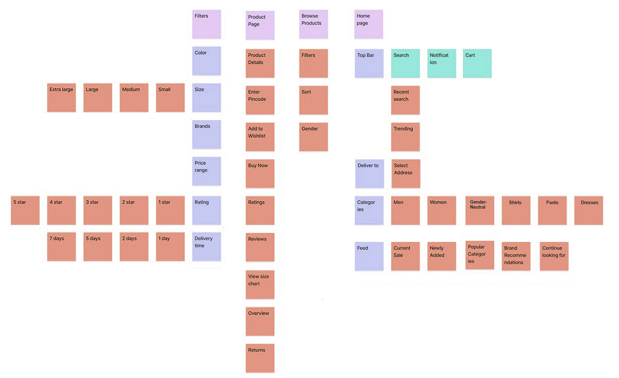
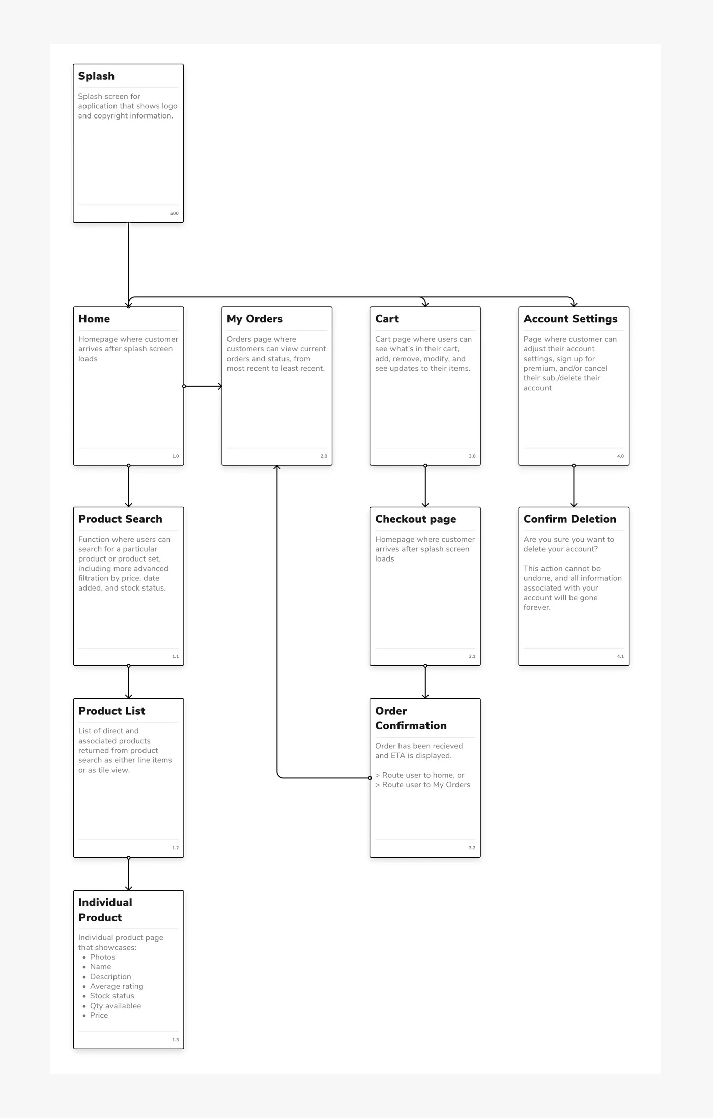
Information Architecture & Sitemap
After brainstorming and reviewing the competitive analysis I came up with the information architecture considering my findings in various stages of the project. Here's a quick, initial structure using card sorting and a sitemap of the sign-up and shopping process for the app.
Card Sorting
Sitemap
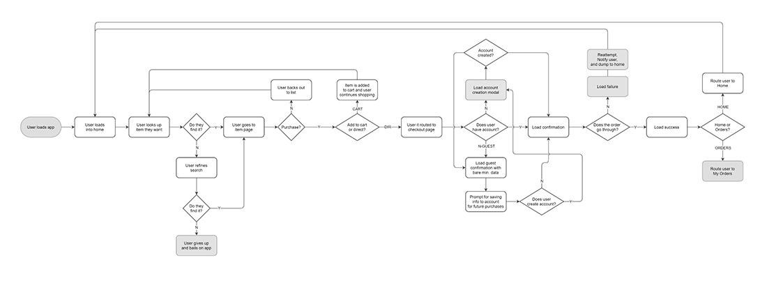
User Flow
To understand more, I made a quick process map — focusing on the initial sign-up and first ordering experience. The map includes some edge cases, showing how the user is able to give up on the app when they are not able to get the desired result. The map shows the user going through a happy path of a successful account creation and order purchase, but also presents an edge case of how the screen can load to fail during an order confirmation.
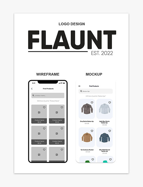
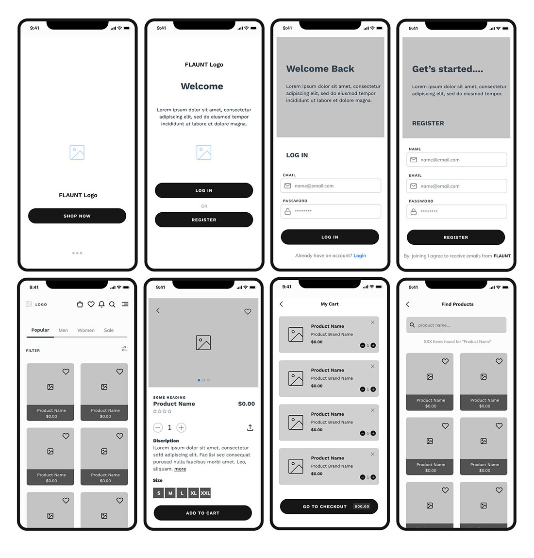
Wireframes
I created a lot of iterations for the different screens of the app. The wireframes helped me make informed decisions on how to structure these screens to achieve the app's ultimate goals.
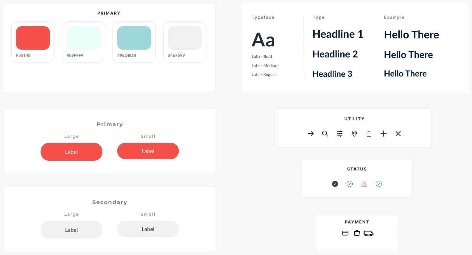
Design Guide
In order to materialize the final product the next step was to design the branding of the app. I put together a design system for the app including the logo, colors, icons, and typography.
Logo Design
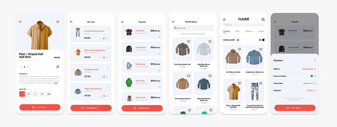
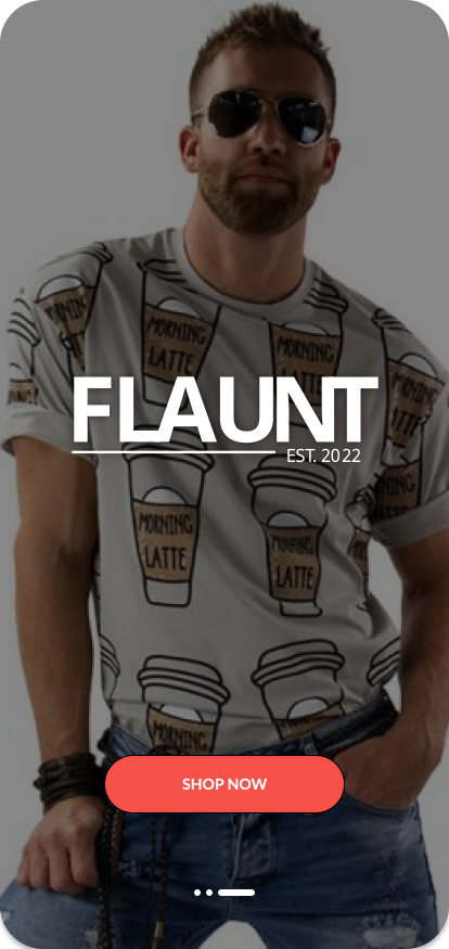
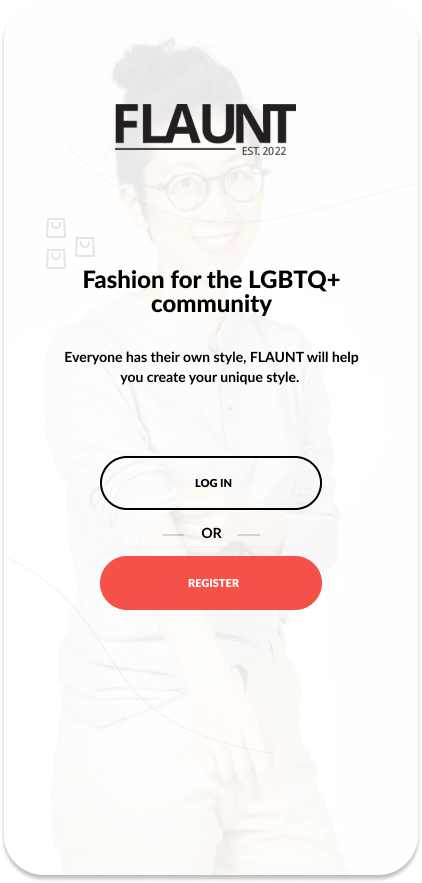
Mockup
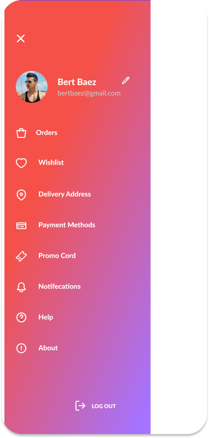
The hi-fidelty mockup was created in Figma. The mockup followed the wireframes closely but some last minute changes were made to some screens last minute. For example, the profile screen now has the menu slide from the left instead of the right. This choice felt more intuitive than the initial wireframe suggested after observing other apps with similar solutions.
Loading
Splash
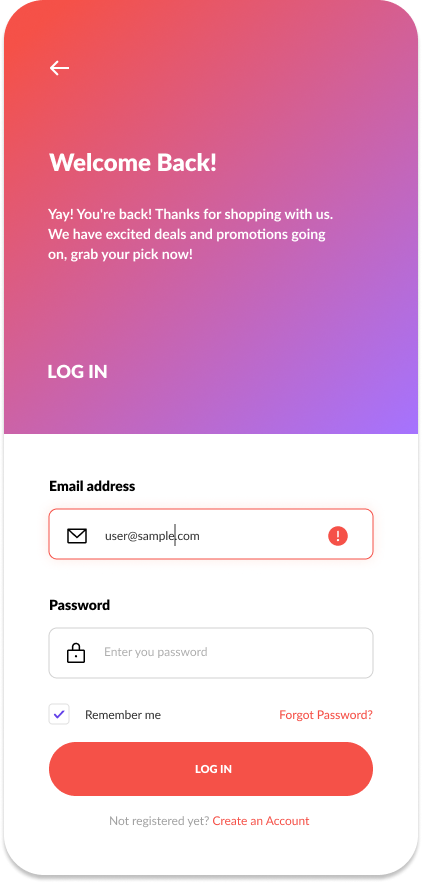
Login
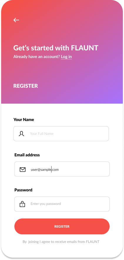
Register
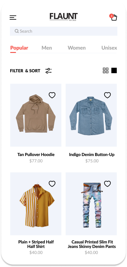
Home
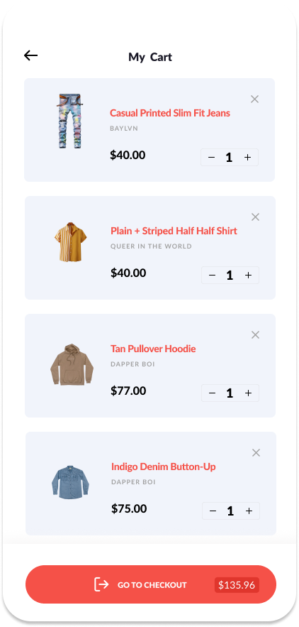
Cart
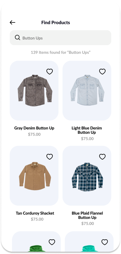
Find
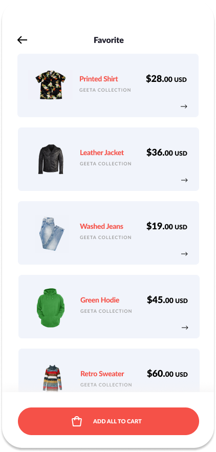
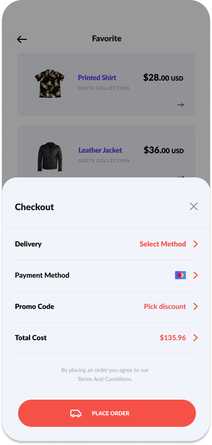
Favorite
Payment Method
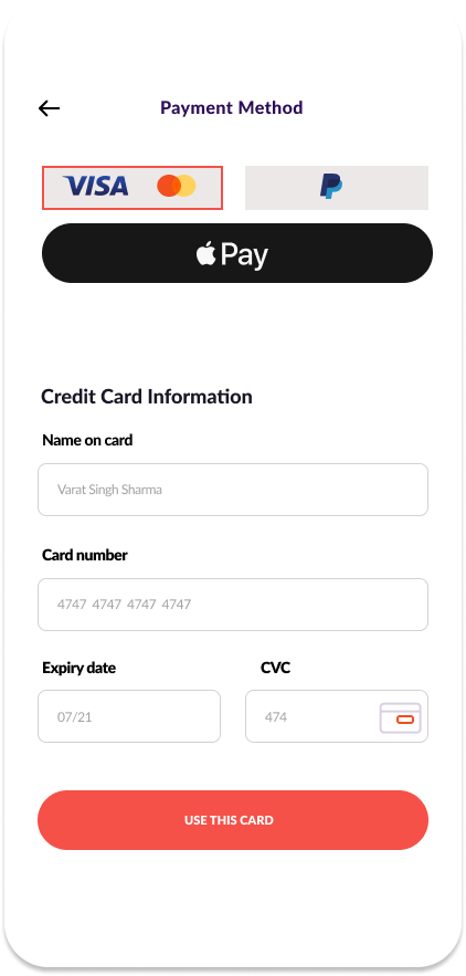
Card
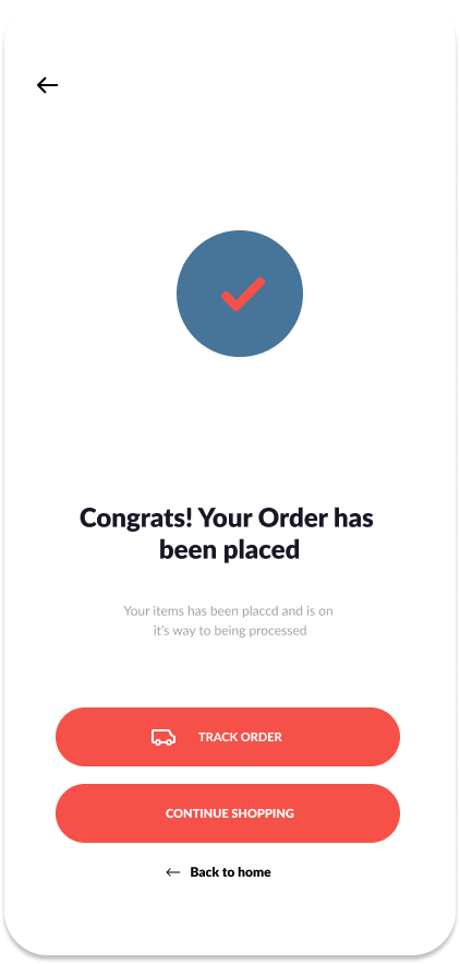
Success
Profile
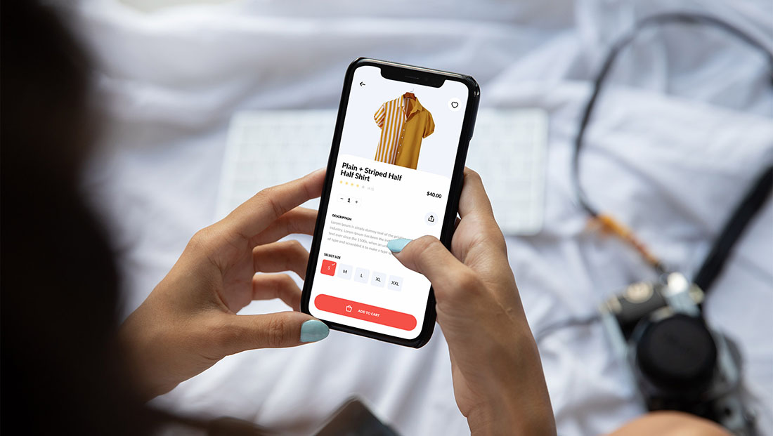
Hi-Fidelity Prototype
While I ran out of time to do a usability test of the final prototype, I feel that this would be a crucial addition to the project in order to identify possible further possible adjustments and improvements.